So in case you’re not following me on social media – It’s Happy Cover Art Day to me! Woo Hoo! Today is the day that The Bloody Maiden’s cover is revealed to the world… isn’t it beautiful! I’m in the unique position of co-founding our publishing company Ink & Fable Ltd. so although I am publishing traditionally, I got to work together with the amazing artist @ArtByKHuggs to create my novel’s beautiful cover & I wanted to share that experience with you so that you understand how it worked. Cover Art can seem like a daunting task – it’s got to encapsulate your story in just an image; it’s got to catch people’s eye & get them to pick it up; in a word it’s EVERYTHING, because despite the common phrase ‘don’t judge a book by it’s cover’, we do, & we should.
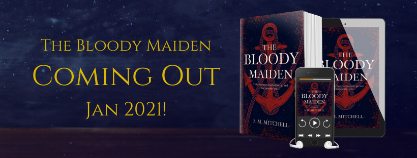
How it worked for myself will obviously not always be the exact process for everyone else, BUT it will give you an idea of what goes into the process as a whole. Book covers are monumentally important. To give you an idea how much here’s a little story… for the first few years that I was into reading I chose books to read solely on the cover. I didn’t bother to read the blurb, or check out a page or two in the book store before I bought it. I bought every book I read for about 3 years based only on the cover, & I enjoyed every single book I read during those years. Book covers MAKE your book, they SELL your book. From looking at a cover, a reader should be able to get a basic idea of what the story is about, who it’s aimed at & it should entice the reader to want to know more so that they pick it up to see the blurb. Prior to the actual work starting we discussed matters such as dimensions for hardbacks, paperbacks, ebook, & audiobook. We also talked about the fact that this is the first book of a series & therefore needs to be a cover which is easy to replicate with imagery/colour differences so that the series covers are all consistent & matching.
[1]
First I had to decide who I wanted to go with for cover art. I had a number of artists who really were amazing, any one of them would have done a fantastic job but in the end I went with ArtByKHuggs because her style fit so well with what I pictured for Maiden. I knew I wanted an illustrated cover as it not only is a popular style for modern covers but it’s also my personal preference. I’m not a fan of photograph style covers with people on. I provided her with a link to the website so that she could see the Pinterest Aesthetic Board for Maiden, the rough blurb I had done at the time, the info such as audience & comparable books. I also sent ArtByKHuggs lots of pictures of book covers that I loved akin to what I wanted for Maiden so that she had an idea prior to the initial concepts were created.
The first concepts were sent back to me after about a week. They were nothing like the cover that is now the finished piece but they were stunning works of art. One thing that ArtByKHuggs did that was absolutely fantastic was along with notes provided with each concept to explain her ideas, she also provided images that she had been inspired by. The image of a swirling red going down into a blue was very clearly meant to represent blood in water which is one of the symbols we discussed right at the beginning.
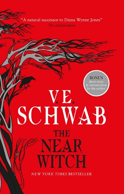
With the initial concepts done I was able to picture the cover better & we were able to work together to develop the cover that you now see. I sent her colour palettes & covers to demonstrate the kind of colours & shades that I felt represented the themes of the book as well as the images that went with them. I also showed her covers that I liked certain aspects of such as the tree growing up the side of The Near Witch’s cover. I took ideas from Jenna Moreci’s novel The Savior’s Champion with it’s simplistic image of hand prints as the main design & we tweaked an initial concept so that the main image was an anchor. The initial concept had knotted rope in the image which I wanted to keep so we tweaked it to wind around the cover similar to the tree on The Near Witch’s cover.


[2]
Round 2 involved taking my feedback from the first set of concepts & creating covers that were more akin to what I was hoping for. KHuggs came back to me after a week with 4 amazing covers! They were all brilliant, 3 all followed a very similar style & the third was completely different. It was just something I wanted to try out in case it worked, it didn’t but it’s better to ask & try than settle for a cover you’re not sure is perfect. I really could have gone with any of the first three covers – they all included the features I wanted. BUT ultimately I went with concept one. The other two were lovely but they had more of an ‘old school fantasy’ vibe a la GRRM or Christopher Paolini rather than the modern illustrations I so adore. Once we had a basic cover that had the main elements I wanted we were able to focus on the details to make it into the cover that it is now. I have been very blessed during this process, KHuggs managed to provide a concept that is very close to the finished product in ROUND 2! I mean talk about being on the same page, other writers have to go through lots of rounds before finding what they want. I can only hope that future covers are half this easy.
So we had the basic design I wanted – central anchor with rope wrapped around it, a central title with a ‘pointy’ font to mimic the fonts often used on fantasy covers. Now it was a matter of getting some extra eyes on it. Naturally I first showed my two besties, they have read The Bloody Maiden in it’s entirety, aside from myself they know the story better than anyone & they are writers themselves. I gave them my opinions & ideas to tweak the cover & got theirs in return. I then moved on to a few trusted buddies who had beta read for me for their opinions/ideas. Once I had gotten the feedback I worked through what I agreed with & passed that on to KHuggs for Round 3.
[3]
The third Round 3 was just incredible. There’s something very emotional about seeing your book come to life. It was both humbling & ego boosting all at once. My book was beginning to form as a physical entity that will by this time next year be in people’s hands. Obviously we were off to a great start as we already had the building blocks for what I wanted so the hardest part was over. So I compiled my minuscule notes for changes & took to my network of reader friends. I created a group chat of friends who I knew were avid readers [some were also writers] & I showed them the current concept with two questions – what do you think this story is about based on cover? & would you pick this cover up in a bookshop? I wanted to gather information from a range of readers to see whether the cover represented the novel & whether it grabbed at their attention enough to check it out closer.
Spectacularly they all managed to grasp important aspects of the novel. Some said it had a pirate/adventure vibe. Others said it was about something deep & emotionally heavy; & a lot of them determined that it involved murder with strong Gothic imagery/settings. I’m also very pleased to say that despite them all reading different things, they all said they’d pick it up to have a look. I hope you guys would too. So I gave KHuggs my final tweaks – I wanted the rope to have a more solid look to it as it went over the anchor; to make the red mottling around the edge more visible as it represented blood; I also changed the lay out of the tag line as originally both halves were the same length making it look rather blocky.
One of my concerns with creating this cover was although the anchor & rope looked AMAZING, I was worried how easy it would be to change the anchor for other images for the rest of the series. So being the awesome person she is KHuggs sent me a couple of sketches to show me 3 possible options for the second cover, keeping the rope wrapped around an image of importance. This is one of the ways she has just gone above & beyond for me with this process, & I’m now so excited to begin actually writing book 2 so that we get to do this all over again.
[4]
Lastly, Round 4 was a freaking BREEZE, this round was meant to finalise any last changes before getting the official cover. But KHuggs is so amazing that we didn’t need a Round 5! The cover you see before you was done & dusted in a month [technically 3 weeks with this actual cover] & isn’t it spectacular!! KHuggs made the entire process super easy for me, I was so nervous to begin with because I didn’t have any inkling to what I even wanted for a cover; & putting your trust in someone else to create a part of your book baby that is so unbelievably important is scary stuff. But she made it really easy!
I think ultimately the reason this worked so well to create the right cover so quickly is that KHuggs listened to every tiny thing I threw at her, loads of covers I liked, colour palettes, images, & just random gibberish. She also includes her own notes next to every concept in each round, as well as images that have inspired her ideas so that I was able to know exactly what she was thinking with each design. I also tried really hard to take a couple days after each concept to let them sink in because it can be really overwhelming at first seeing covers & feeling like you just have to choose one. I took those days, I compiled notes of every single thought that crossed my mind. I took notes of everyone else’s impressions & feedback & then once my mind had stopped swirling I sorted those notes coherently to give to KHuggs so that we could put it into action. So I hope that this has given you some insight into getting a cover sorted, it was a great experience & I can’t wait to do it again for book 2. I hope you love the cover!


Leave a comment