I have loved developing the covers for the books in The Western Tides universe so far. I’ve been working with @artbykhuggs for a long time now and she is fantastic at what she does. Her skill set and professionalism are second to none. I hope that I can be lucky enough to hire her for all future book projects. I really couldn’t ask for a better cover artist. This trilogy, starting with The Bloody Maiden is part of a larger series called Tales From The Western Tides. It was very important to me that the covers were symbolic whilst also looking attractive to draw in readers and accurately represent the genre of the stories. Despite the strong feelings of what I wanted my covers to convey – I didn’t actually have any specific ideas for the look of them when I first hired ArtByKHuggs. This is where she came in super handy. I have no doubt that these covers wouldn’t be as beautiful and meaningful as they are if I hadn’t met ArtByKHuggs. Because of that I have asked for her insight into the designs for this blog post.
I provided ArtByKHugss with some covers I enjoyed, and colour palettes to help convey my thoughts. I maintain that the more information you can provide your artist the better the process will be for both of you. I knew I wanted an illustrated cover as it not only is a popular style for modern covers but it’s also my personal preference. I’m not a fan of photograph style covers with people on. I provided her with a link to the website so that she could see the Pinterest Aesthetic Board for Maiden, the rough blurb I had done at the time, the info such as audience and comparable books. I also sent ArtByKHuggs lots of pictures of book covers that I loved akin to what I wanted for Maiden so that she had an idea prior to the initial concepts were created. We also focused on the importance of cohesive designs, that during the process of designing Book 1’s cover, we were also ensuring that this style could be replicated beautifully for the rest of the trilogy.


The Bloody Maiden
Primary Graphic: Ship Anchor in a Cleat Hitch
Colors: Deep Blue Background with Red Graphics
‘Sophie had a lot of great ideas for her cover and while we explored a couple different concepts initially, we quickly landed on the anchor+knot imagery. An anchor was a clean and instantly recognizable symbol of nautical adventure, but also the weight of Prudence’s past as she “cut-anchor” and escaped the life she’d known. The knot depicted encircling the anchor is a Cleat Hitch, one of the most common nautical knots. It’s most often used when securing a boat at dock and, similar to the anchor, it’s shown loose as Prudence escaped one life only to discover new allegiances that began to tie her to a new life at sea. Throughout the design process, Sophie’s clear sense of the tone she wanted to set with the cover guided development. The final color scheme we settled on – deep (ocean) blue with blood red graphics – really suited the title and darker themes of the book.’

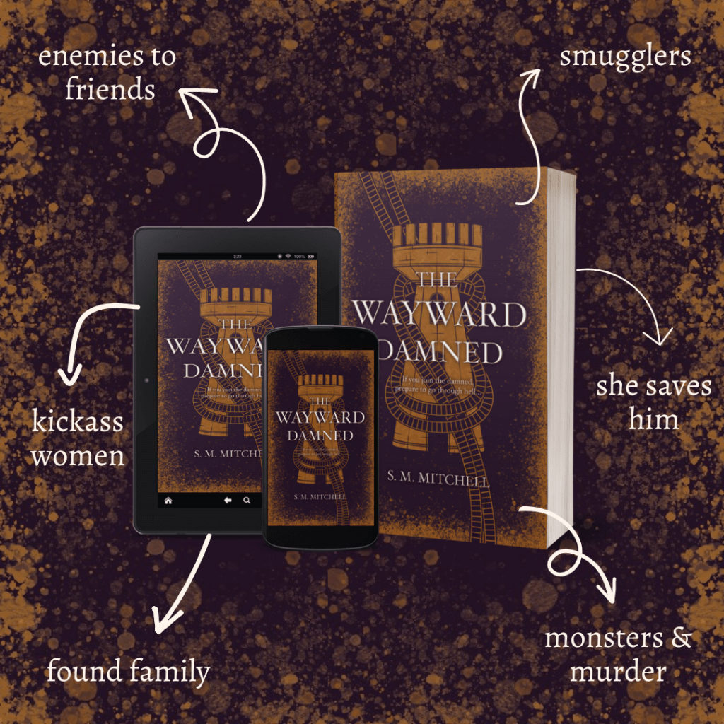
The Wayward Damned
Primary Graphic: Tower in a Figure-Eight Bend
Colors: Deep Purple Background with Gold Graphics
‘A key part of designing The Bloody Maiden’s cover was considering how it could be adapted to the rest of the series. Sophie and I both liked the idea of key visuals wrapped in different knots and I had provided some initial sketches during TBM development. When the time came to create The Wayward Damned cover, we returned to one of those sketches and developed it! Sophie also had colors already picked out: Royal (but dark) Purple and Gold. Between the strong initial sketch and the established color scheme this cover came together incredibly smoothly and fits seamlessly beside The Bloody Maiden. The knot on the cover is a “Figure-Eight Bend,” which is used in both sailing and climbing, to join together two pieces of rope that are roughly the same size. The parallels to Prudence and Cain were too good to pass up! In terms of the tower element, Sophie gave me some spoilers as to what happens in Book 2, but you’ll just have to read it and see if you think it fits!’

Leave a comment